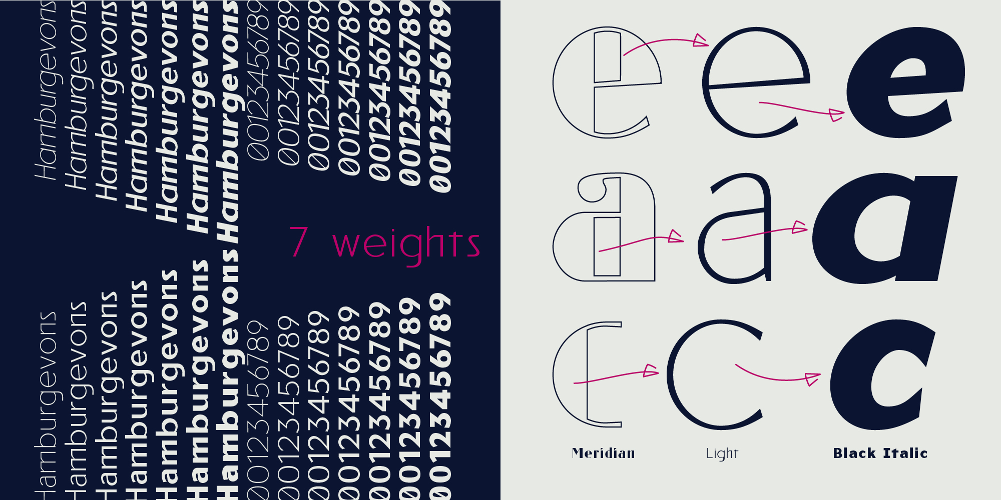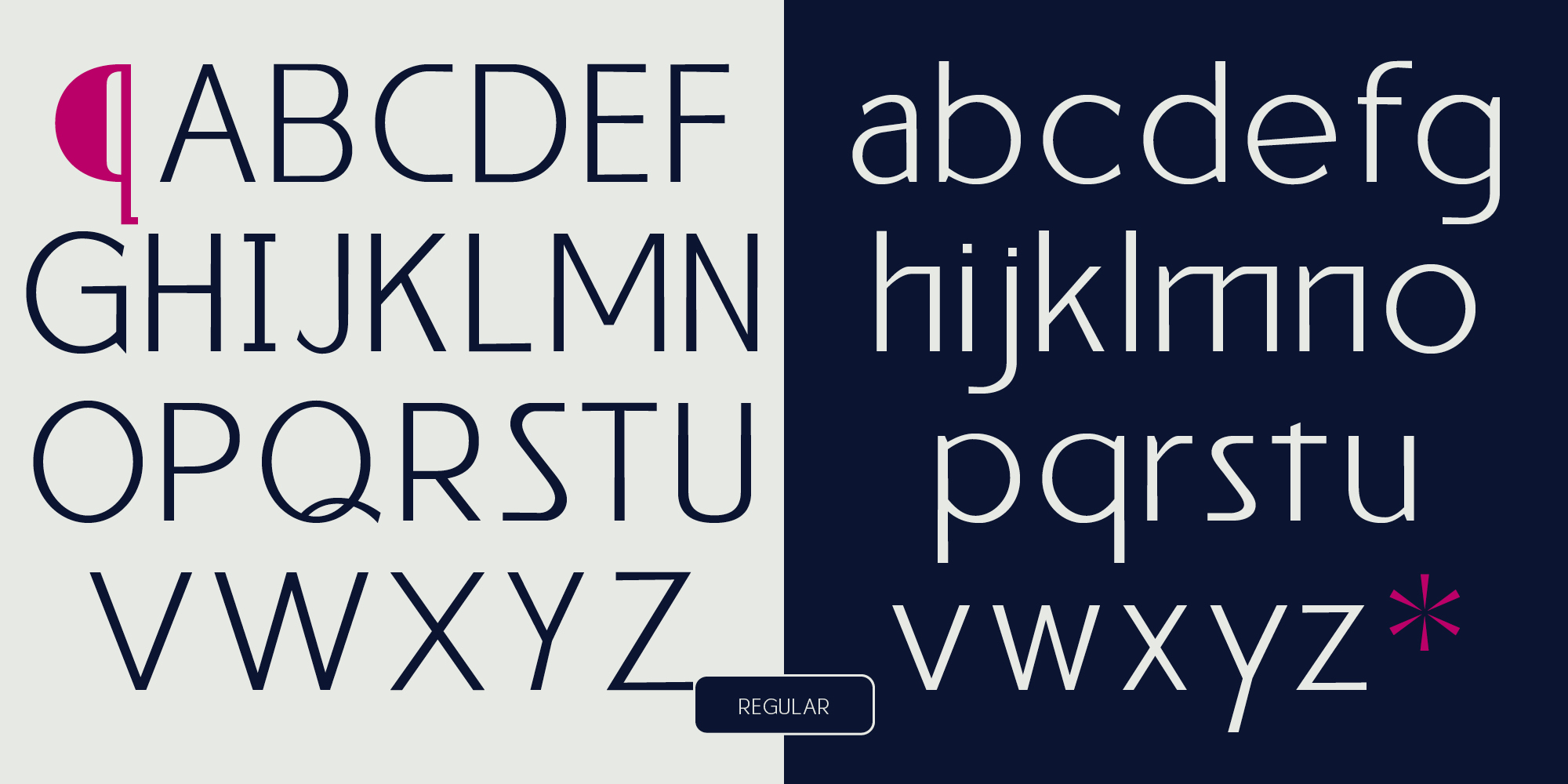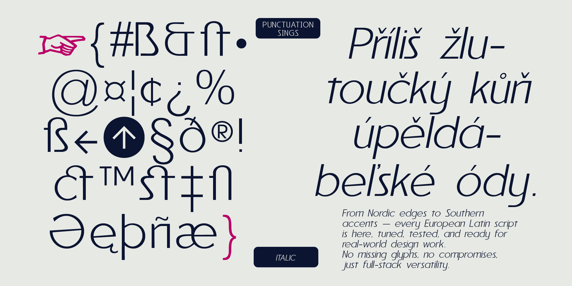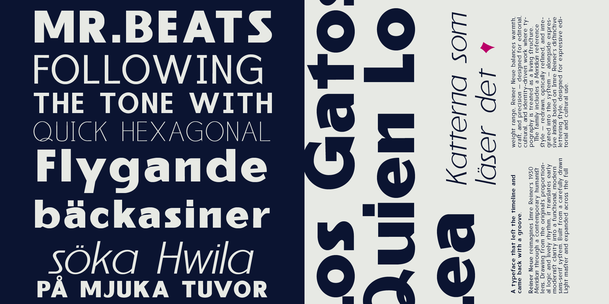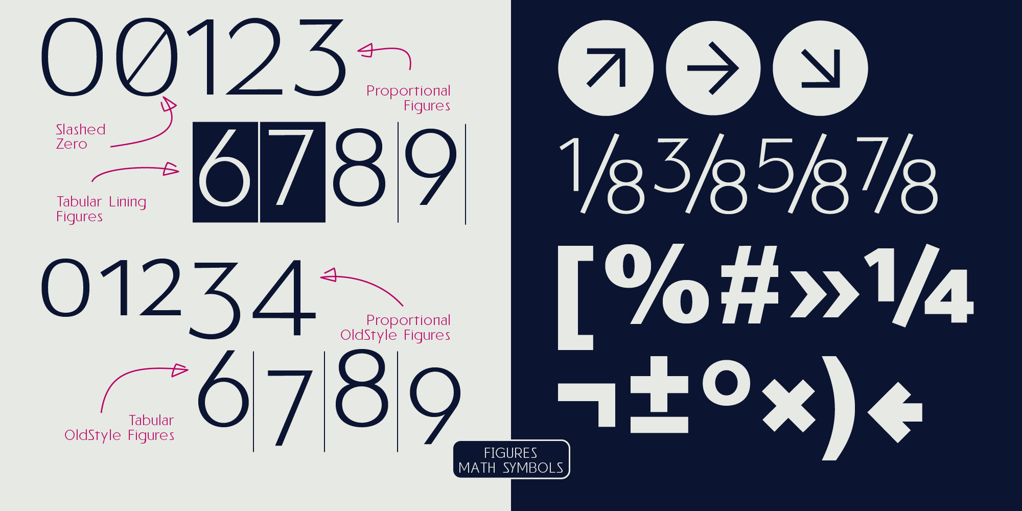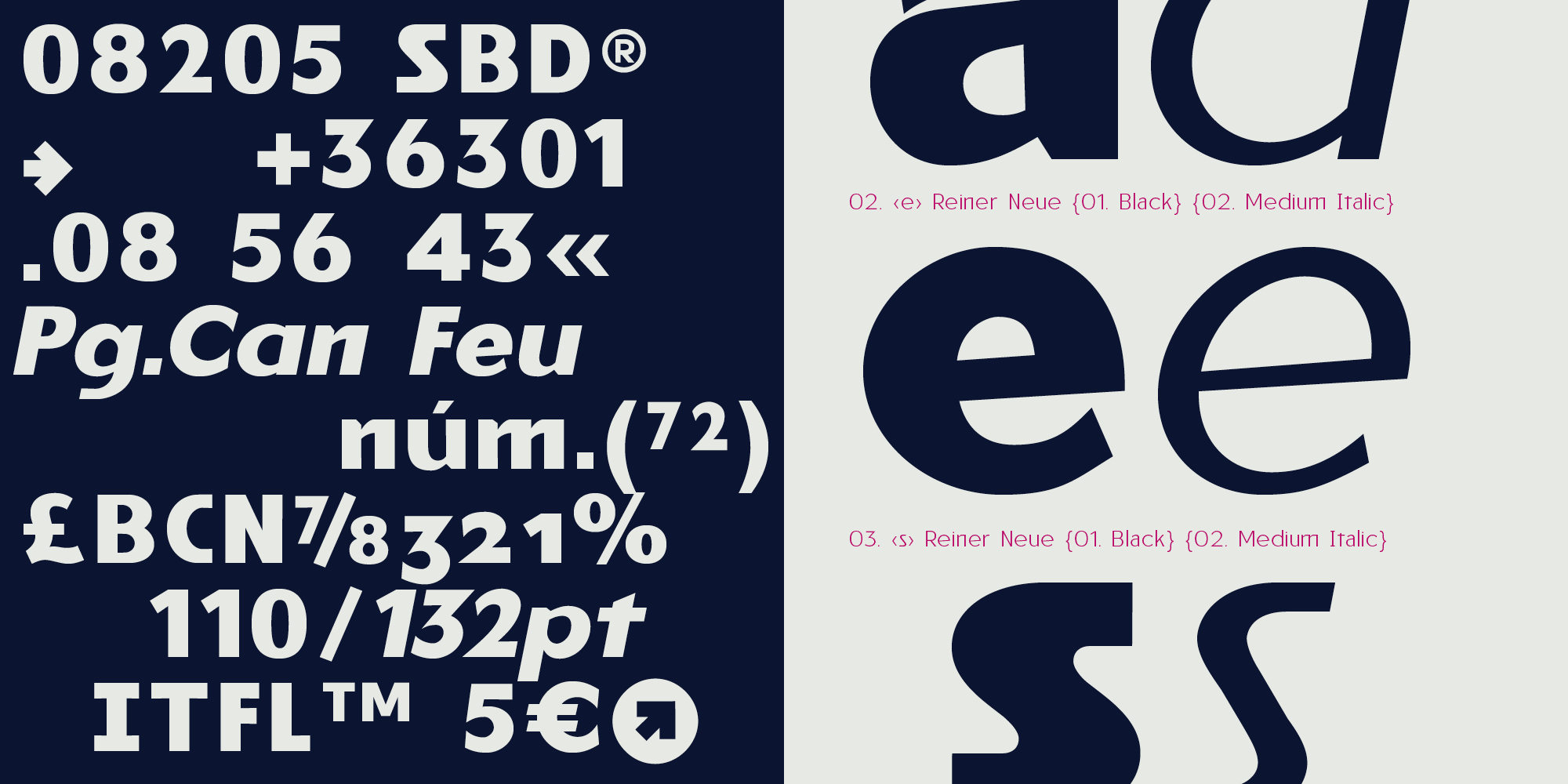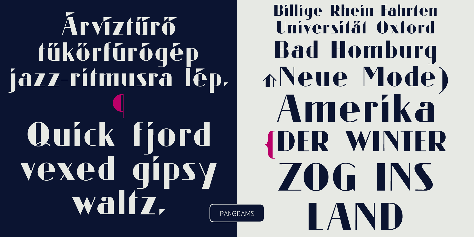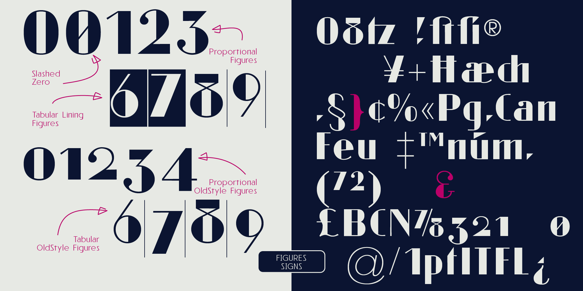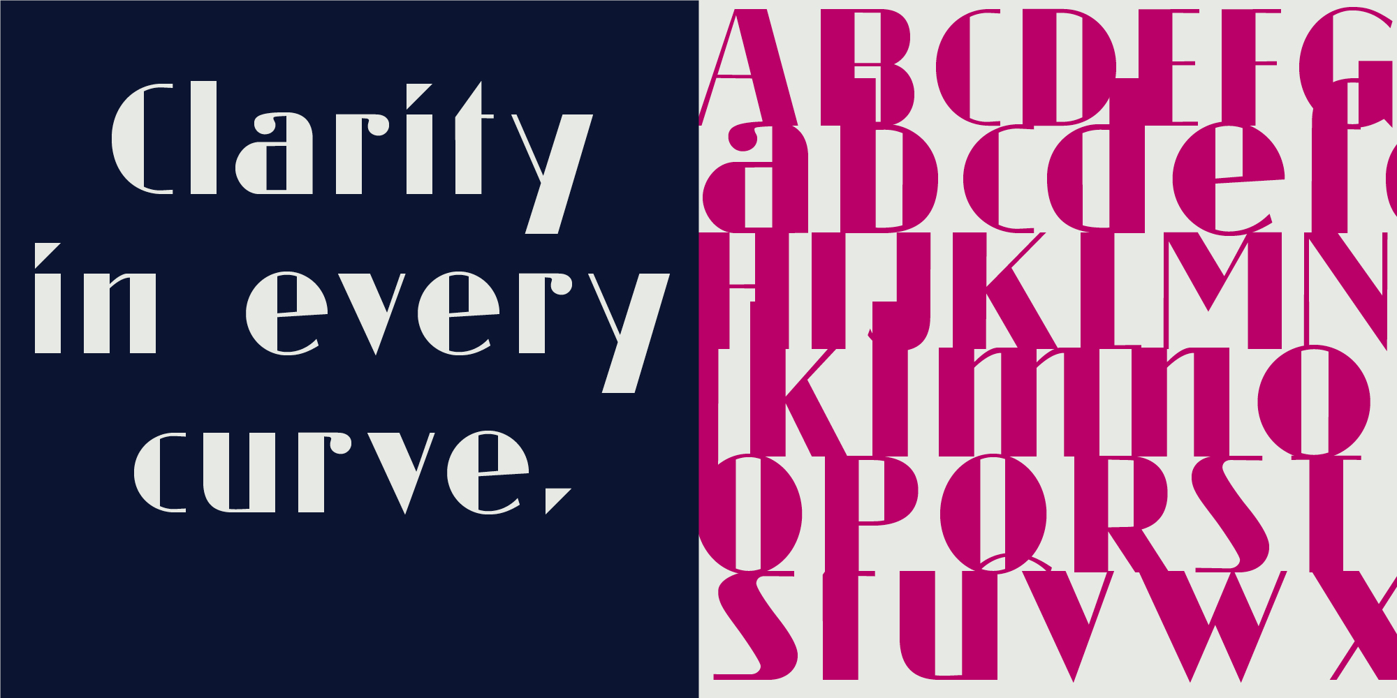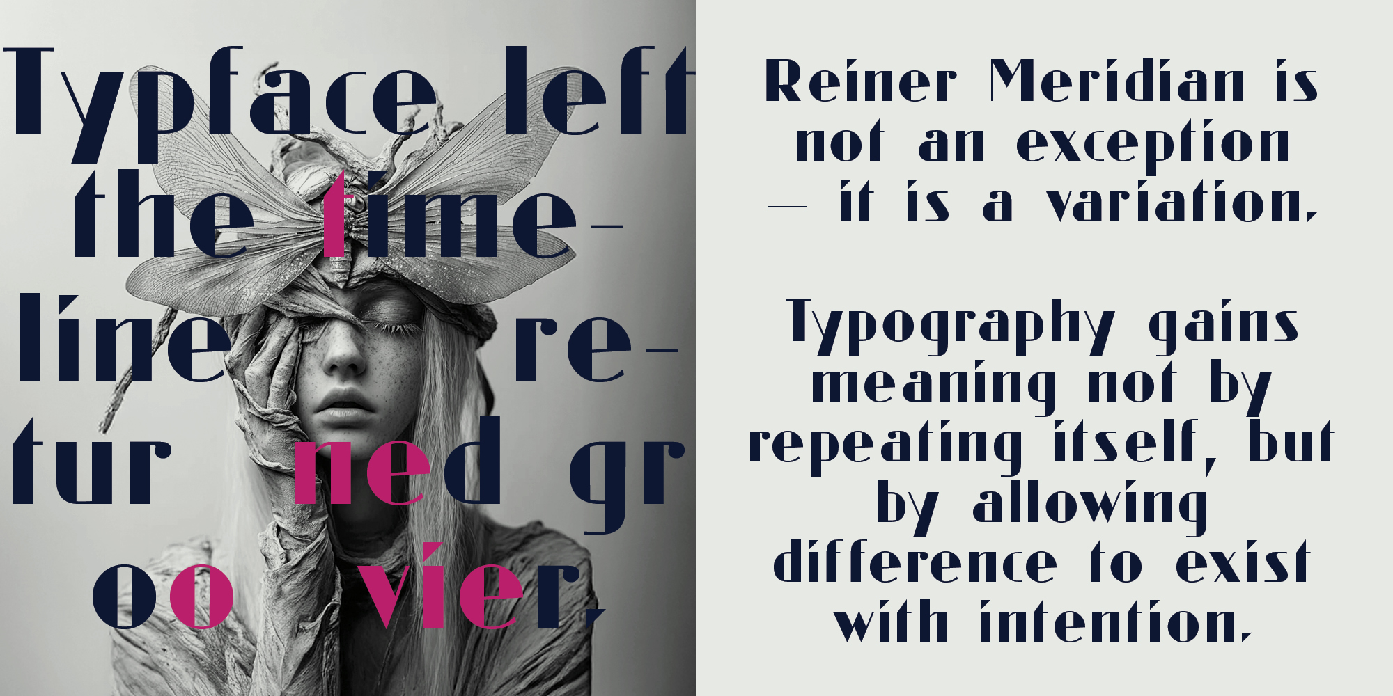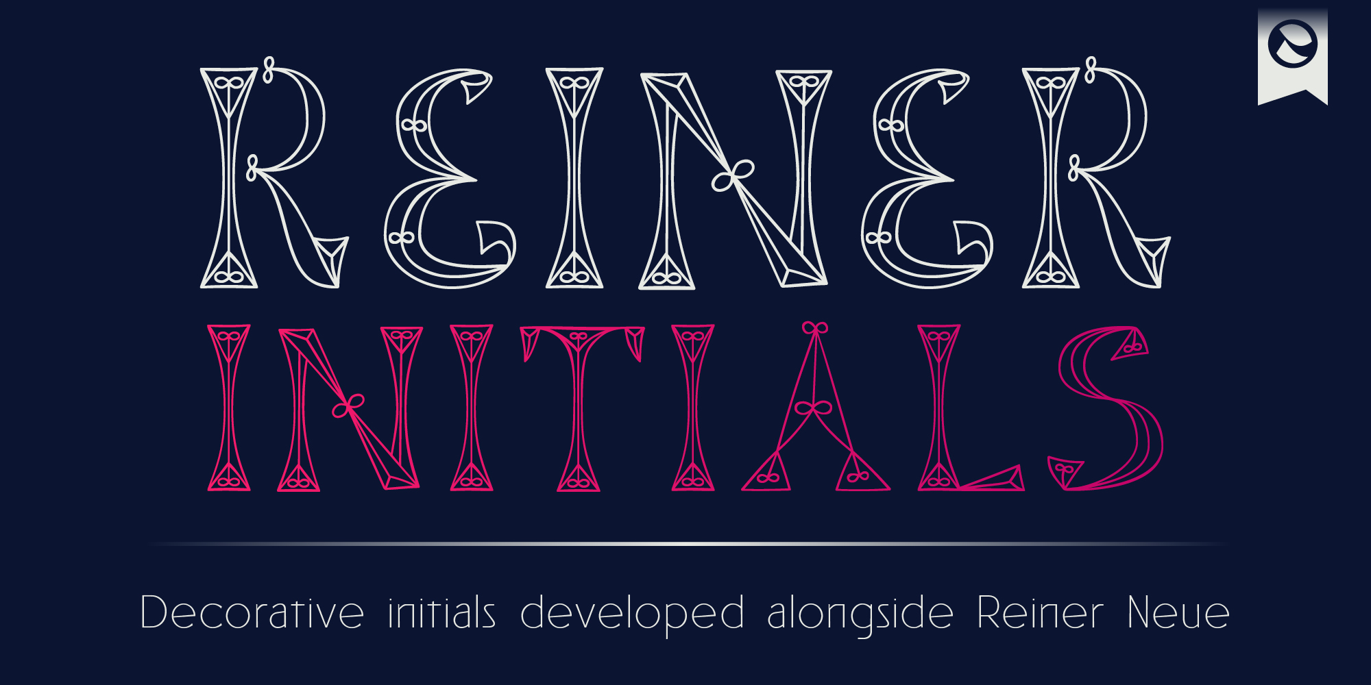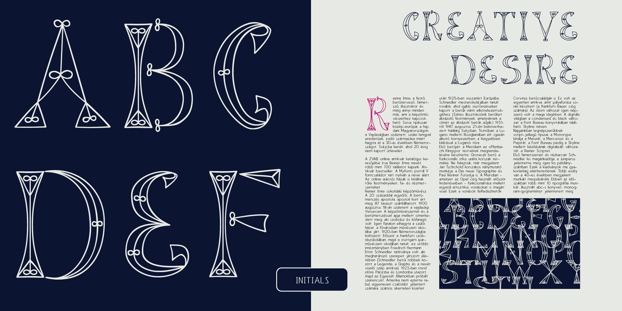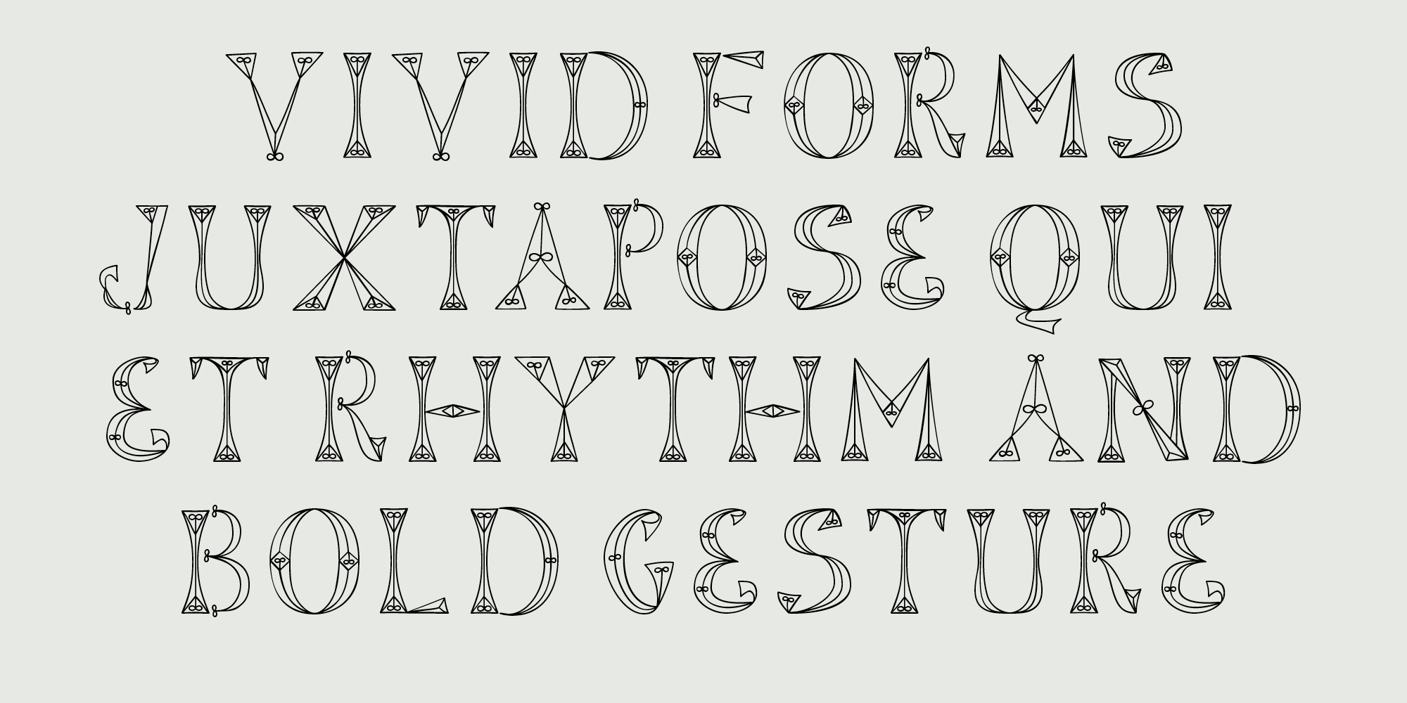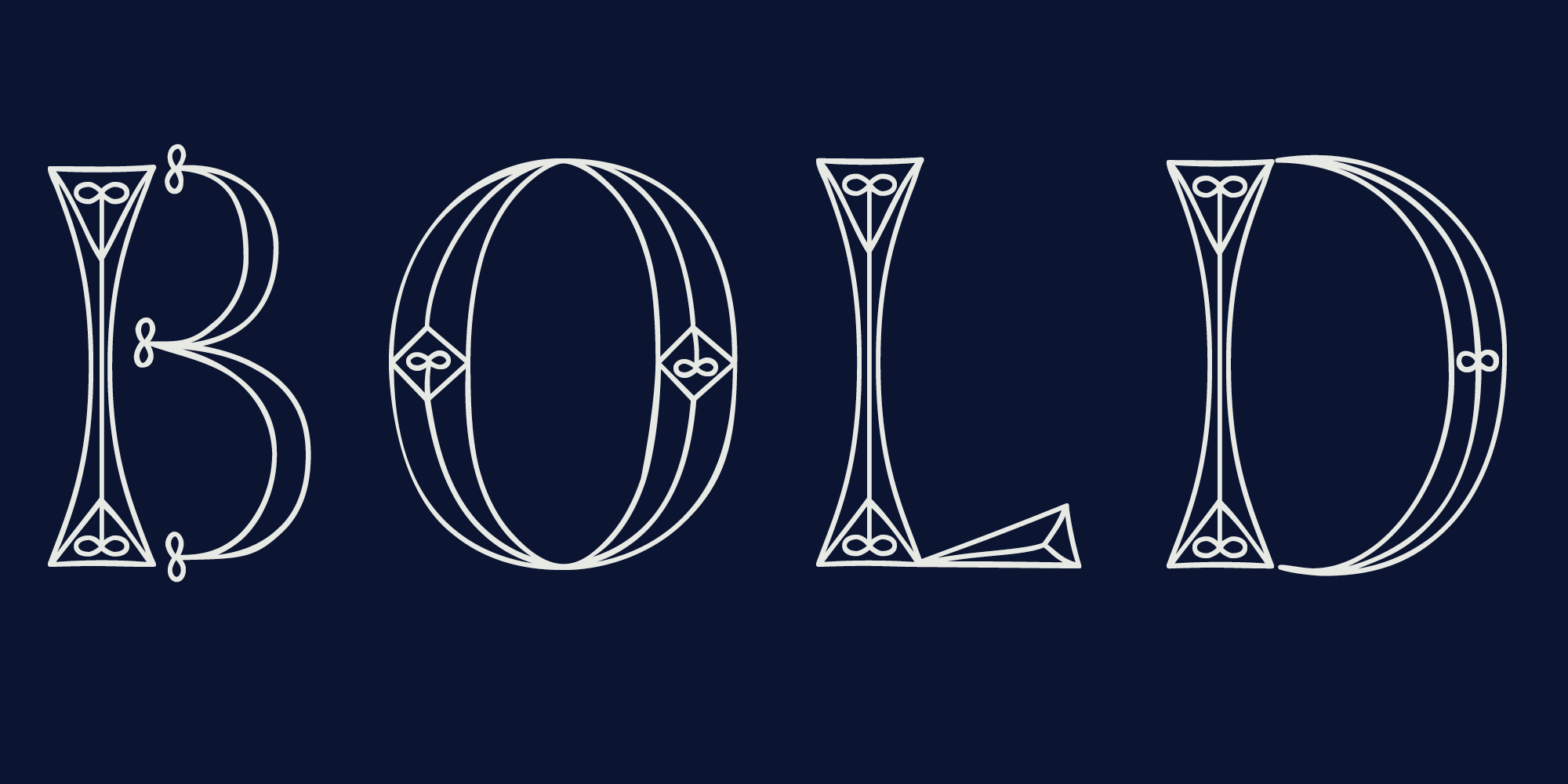
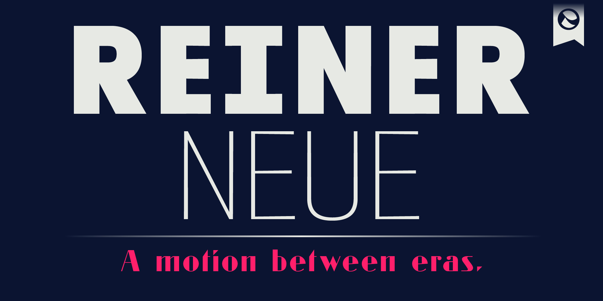
A typeface that left the timeline and came back with a groove. Reiner Neue reimagines Imre Reiner’s 1930 Meridian through a contemporary humanist lens. Drawing from the original’s proportional logic and lively rhythm, it translates early modernist clarity into a functional, modern sans-serif system. Built from a carefully drawn Light master and expanded across the full weight range, Reiner Neue balances warmth, craft, and precision — designed for editorial, cultural, and identity-driven work where typography is treated as a living structure. The family includes a Meridian reference style — redrawn, optically refined, and integrated into the system — alongside expressive Initials based on Imre Reiner’s distinctive lettering style, designed for expressive editorial and cultural use.

Reiner Neue

Release date: 02 2026 | by Amondó Szegi
Published on MyFonts | 4 styles, 7 weights | from $35
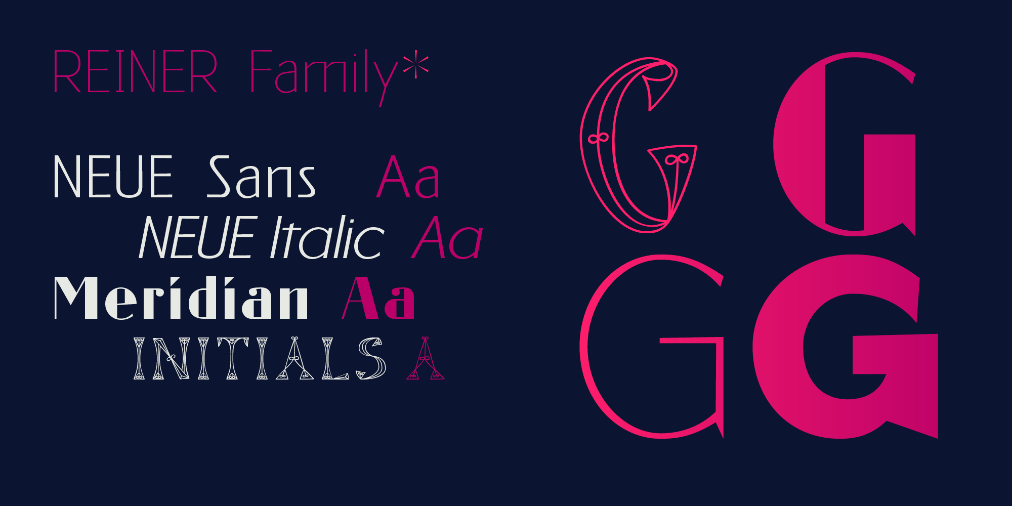
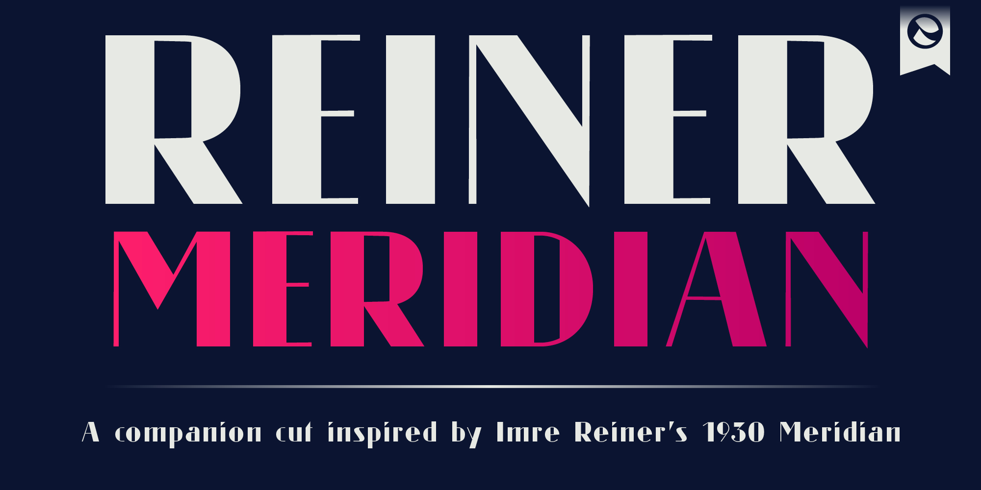
Reiner Meridian is not an exception — it is a variation.

Designed within the Reiner Neue system, it explores how historical form can operate inside contemporary structure. Expression here is not decoration, but controlled deviation.

Typography gains meaning not by repeating itself, but by allowing difference to exist with intention.

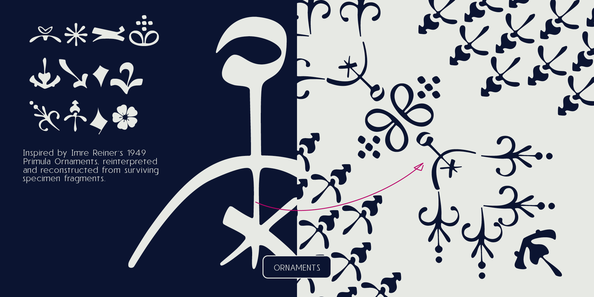
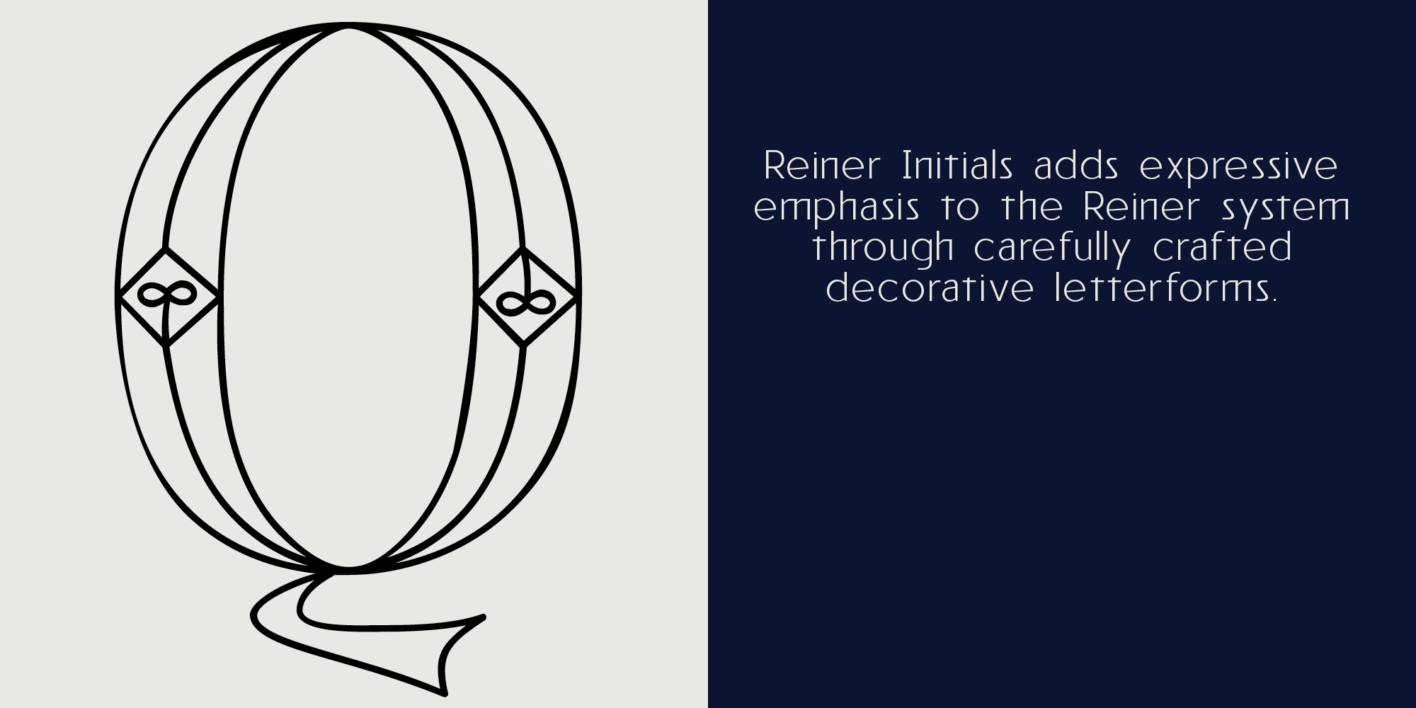
Reiner Initials adds expressive emphasis to the Reiner system through carefully crafted decorative letterforms.

From Meridian to Reiner Neue

A typographic system across time

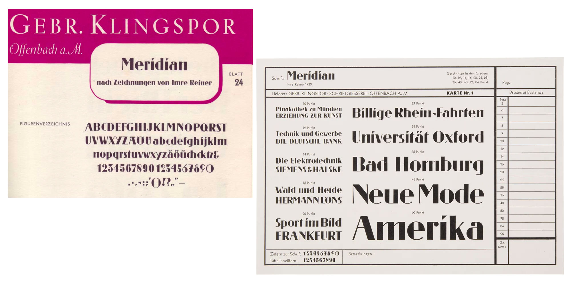
Imre Reiner’s Meridian, designed in the early 1930s, belongs to a moment when typography was redefining its own role. Functional thinking had already taken hold — Jan Tschichold’s Die neue Typographie and Paul Renner’s Futura were reshaping visual culture — yet Meridian stood slightly apart. It was a linear, sans-serif antiqua, clearly aligned with modernist clarity, but carrying a distinct artistic tension in its proportions and internal rhythm.

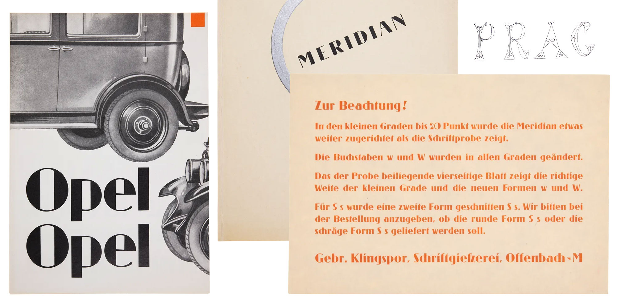
Commissioned by the Klingspor foundry in Offenbach, Meridian found early application in German industrial and advertising contexts, including automotive catalogues of the era. These were not display experiments but working typographic environments — brochures, announcements, and printed matter in which form and function had to coexist. Meridian’s strength was precisely this balance: structural discipline paired with an unmistakable graphic presence.

What makes Meridian interesting today is not nostalgia, but attitude. Its letterforms are not neutral. Strokes carry weight unevenly, counters feel charged, and proportions subtly resist standardization. In hindsight, Meridian feels less like a finished system and more like a snapshot of a typographic mindset — modern, but still expressive.