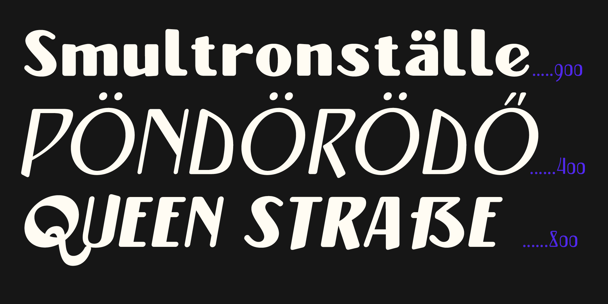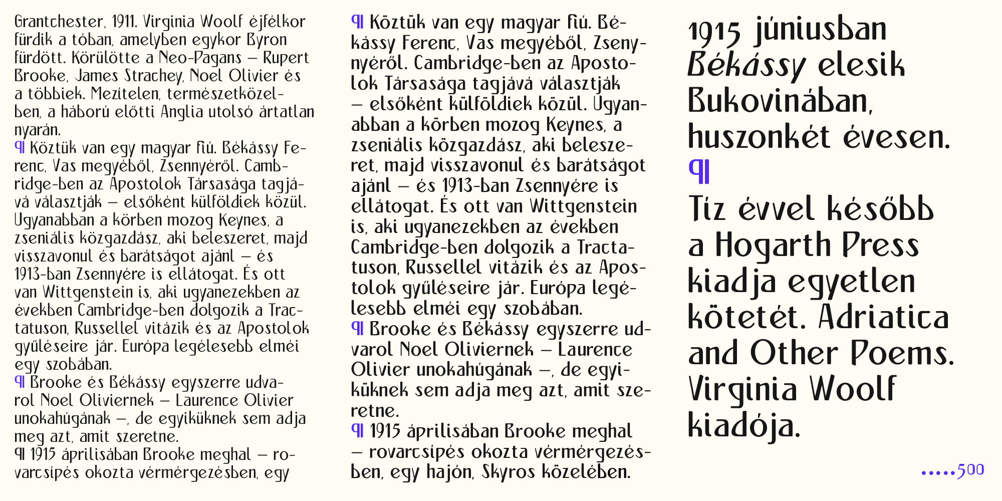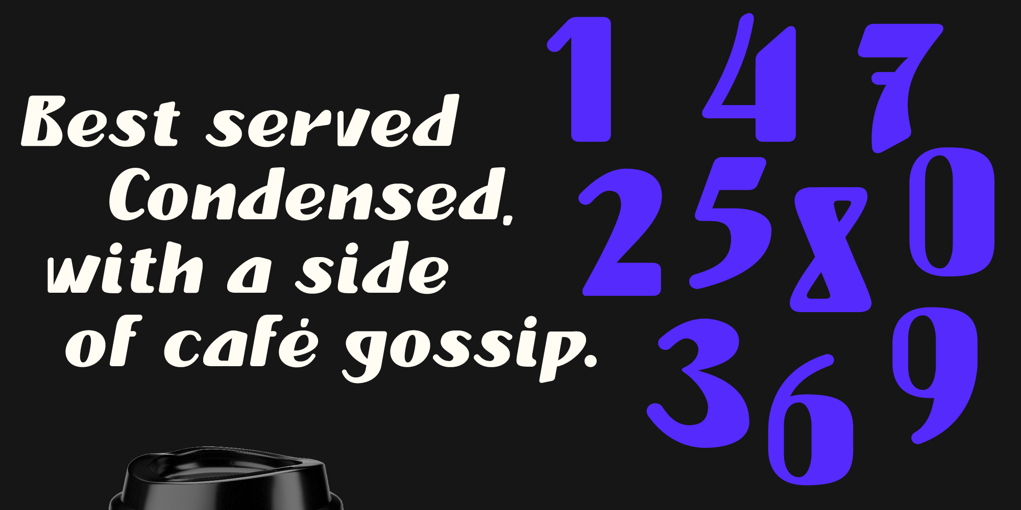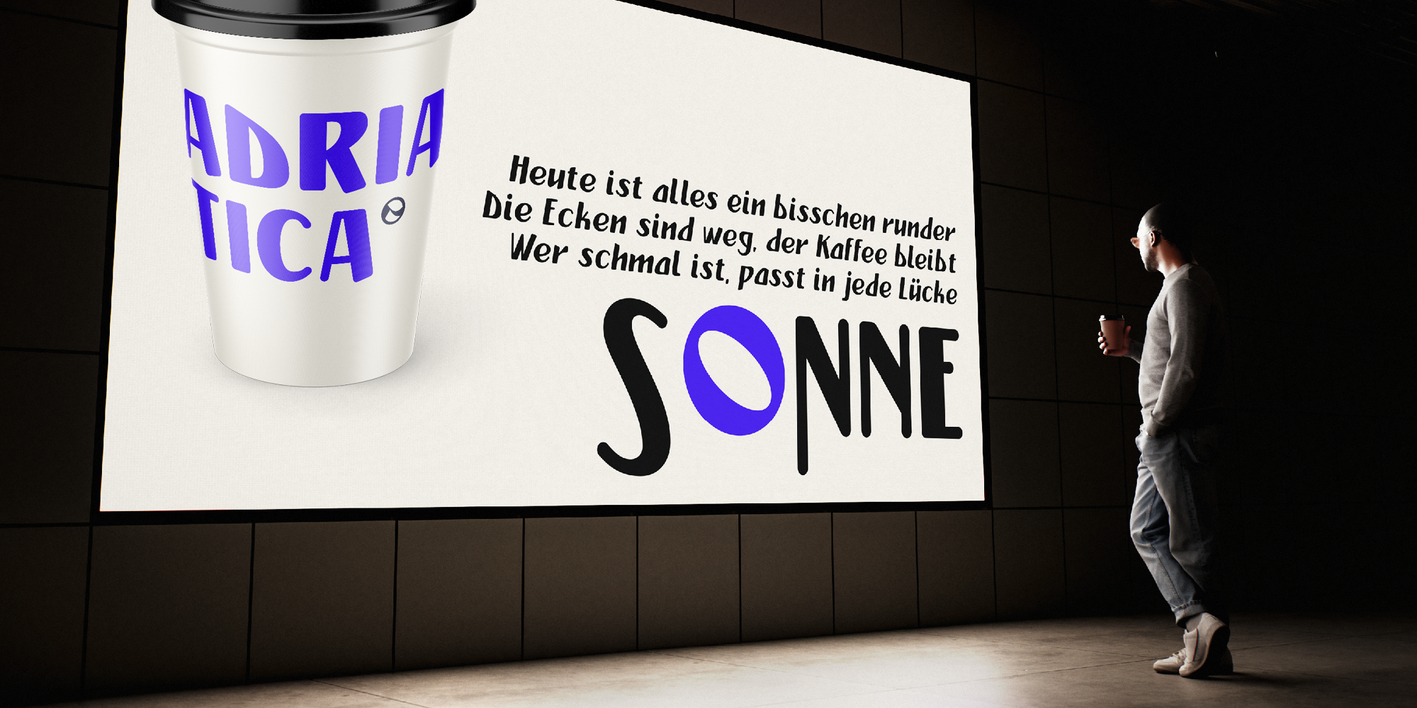
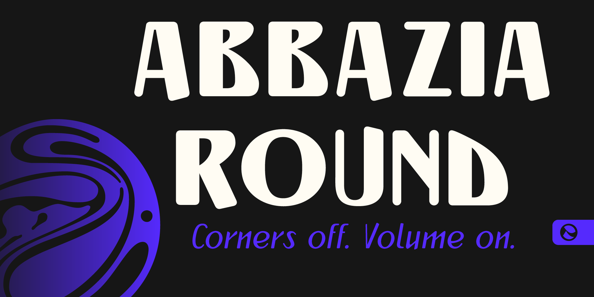
Abbazia Round gives art directors a condensed display face with personality built in: tall, narrow letters that set tight headlines in very little space, softened by rounded terminals that keep the tone friendly instead of fussy. It is made for headlines, posters, packaging, social graphics, and anything that needs to grab attention fast, and it holds up in short passages of text too.
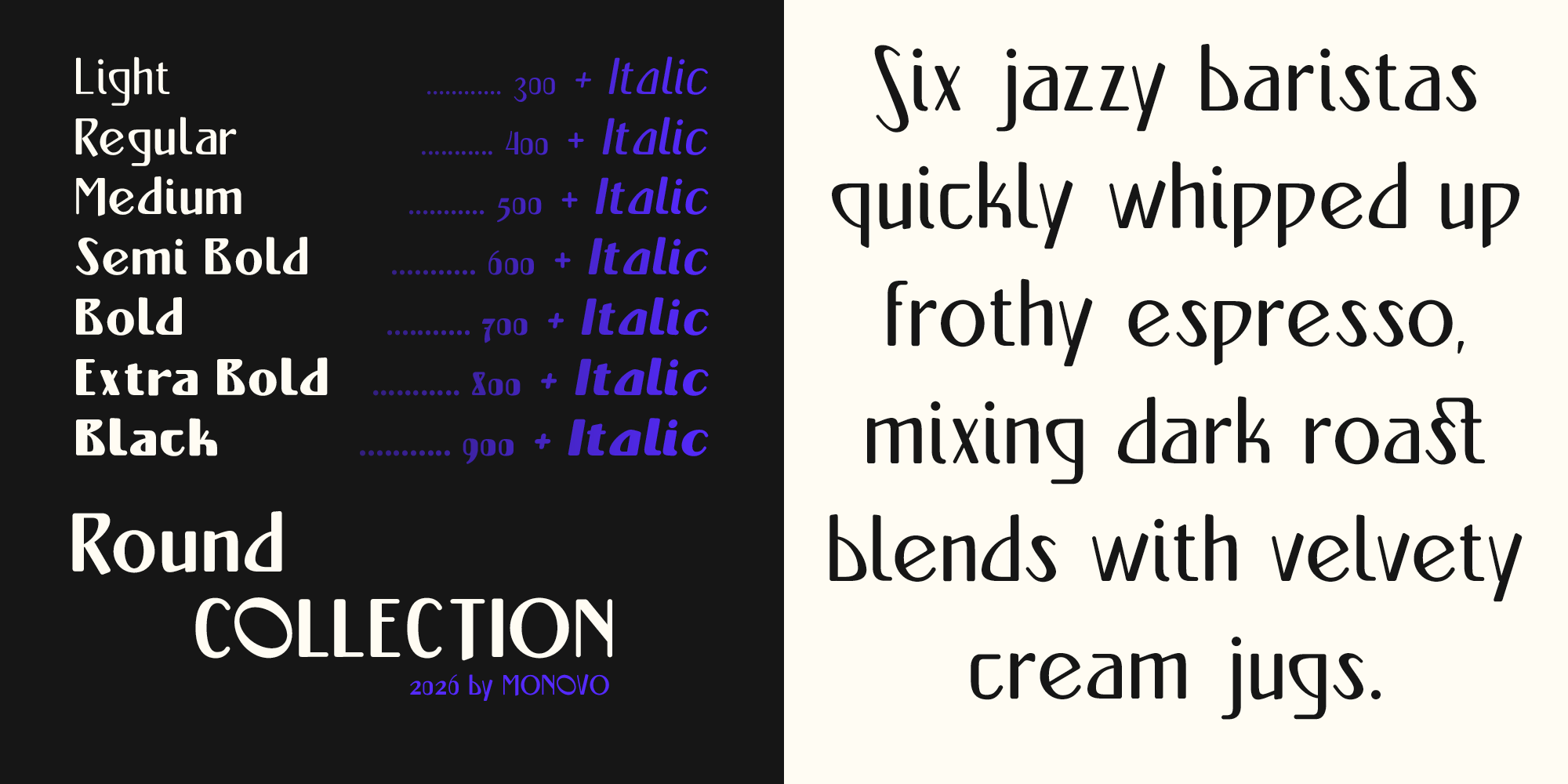
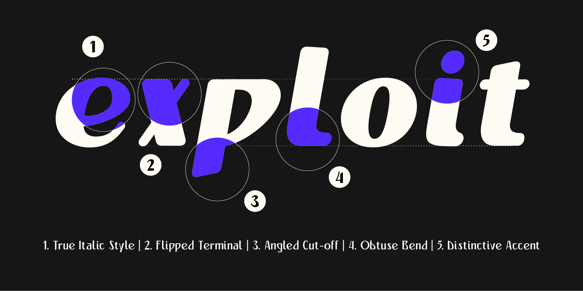
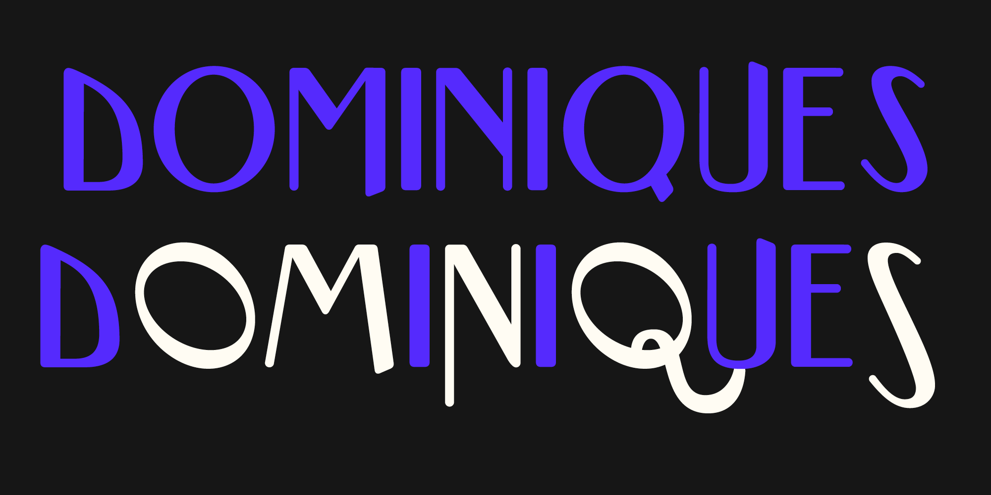
Seven weights from Light to Black, each in Roman and a true Italic, give you a full hierarchy within a single family. Use the heavier cuts for loud, sticker-style statements and the lighter ones for refined, editorial settings. The asymmetric strokes and playful details keep copy memorable even at a glance, which makes it a natural fit for food and drink branding, playful editorial work, merch, and anything that has to stand out on a shelf or in a feed.
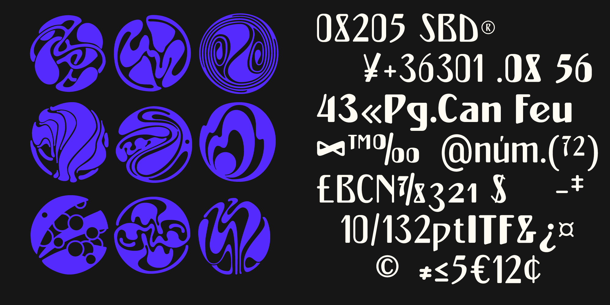
Koloman Moser’s 1899 ornamental designs, redrawn for this release, are included as extra glyphs and sit naturally alongside the characters. Find them in the Glyphs panel of any application that supports it, such as Adobe Illustrator, Photoshop or InDesign.
The design is based on a 1901 display type from the Hornyánszky specimen book, which showed only capitals; the lowercase was newly drawn for this release. The name comes from Café Abbázia, the Budapest artists’ coffeehouse of the turn of the century, and from the Adriatic resort it was named after.
Abbazia Round
Release date: 10 2026 | by Amondó Szegi
Published on MyFonts
2 Styles | 7 Weights